Portfolio
SHREESH PATIL
COMPUTER ENGINEER / UI-UX / SYSTEM DESIGN
Building scalable systems and brutalist UX for real-world impact.
About
Computer engineer focused on systems, security, and UX.
I design clean, structured digital experiences.
Systems-first thinking
Security-focused design
Performance-aware engineering
Projects
UX CASE STUDY — ERP REDESIGN
ERP UI/UX Redesign
ERP UI/UX REDESIGN
Problem
The existing university ERP portal was desktop-only, visually inconsistent, and required students to navigate 4–6 screens to access basic information like attendance, fees, or today's schedule. No unified design language existed across modules — each section felt like a separate product.
Students needed to switch between three disconnected modules — academics, accounts, and examination — each with its own login flow, navigation pattern, and visual language. Core daily tasks like checking attendance or viewing fee dues required multiple redirects and re-authentication steps, creating unnecessary friction for routine use.
The information hierarchy within each module was inconsistent. Primary actions competed visually with secondary ones, and dense data tables were presented without summarisation or prioritisation. There was no mobile-responsive layout, making the system difficult to use on smartphones — the primary device for most students. Duplicated workflows across modules (e.g., separate fee views in both the accounts and examination portals) added confusion without adding value.
Fragmented access across attendance, academic records, fee payments, results, and timetables
Inconsistent navigation patterns — each module behaved like a standalone application
No mobile-first experience; the portal was unusable on smaller screens
Poor information hierarchy with data-heavy pages and no clear visual priority
Duplicated workflows forcing students to re-enter the same context in multiple places
Repeated login prompts and session timeouts disrupting daily usage
4–6 taps
to reach any key info
0 mobile screens
in the original system
3 separate codebases
for academics, accounts & results
Approach
One system. One language. One tap to anything.
The redesign unified all ERP modules under a single mobile-first interface built around the student's daily flow — login once, see everything relevant on the dashboard, drill into any module in one tap. A shared component library (cards, list rows, status chips) creates visual consistency across academics, accounts, and results.
The process began with a full interface audit of the existing system — cataloguing every screen, navigation pattern, and interaction. This was followed by an information architecture review to understand how data was structured and surfaced across modules. Workflow mapping helped identify where students encountered the most friction, and a component inventory revealed the extent of visual inconsistency between sections.
Audit all existing screens for information hierarchy and navigation patterns
Review information architecture and identify redundant or fragmented workflows
Map student task flows for the five most common daily interactions
Build a component inventory and define a unified design token set
Redesign each module as a card-based, scrollable mobile view
Introduce a persistent bottom nav for zero-cost navigation
Validate with student walkthroughs on 5 core tasks
A unified design system was created to replace the ad hoc styling that had accumulated across modules. Defining a single token set — one primary colour, a consistent type scale, and standardised spacing units — meant every new screen could be built from the same foundation, reducing design debt and ensuring visual coherence without additional effort per module.
Card-based layouts were chosen because they map naturally to the way students scan academic information: one card per subject, one card per fee item, one card per notice. Mobile-first navigation was prioritised to reduce the number of taps required for routine tasks. The goal was to make attendance, timetable, and fee status reachable within two interactions from the home screen, matching the mental model students already had from consumer apps.
Design Journey
Discovery & Audit
The process started with a structured review of the existing ERP portal. Every screen was catalogued — login flows, module landing pages, data tables, and settings panels. The goal was to understand what the system was actually asking students to do, not what it was designed to do in theory.
The audit revealed that the portal had grown organically over time, with each module developed independently. Navigation labels were inconsistent, iconography varied between sections, and the same action (e.g., viewing a fee receipt) was accessible through different paths depending on which module the student entered from.
User Pain Points
Walkthrough-based evaluations with students identified that attendance, timetable, fees, and results were the four most frequently accessed sections — yet none were reachable from a single consolidated view. Students routinely opened multiple browser tabs or logged into the portal two to three times per session to complete tasks that should have been a single flow.
Scenario testing surfaced a consistent pattern: students preferred dashboard-based navigation where key information was summarised upfront, rather than navigating through module-level menus to locate data. The existing module-based structure forced users to know where information was stored rather than letting the interface surface it contextually. Repeated login prompts and unclear session states added to the cognitive load.
Information Architecture
The existing system was structured around administrative modules — Academics, Accounts, Examination — which reflected the backend organisation but not the student's mental model. The redesign reorganised content around tasks and frequency of access. High-priority items (today's timetable, pending fees, recent results) were elevated to the dashboard level. Lower-frequency items were moved one level deeper.
Navigation depth was reduced by collapsing redundant intermediate screens. In the original system, viewing a subject's attendance required three navigations: module selection, academic year selection, then subject selection. The redesigned flow surfaced attendance by subject directly from the dashboard, reachable in one tap. Most daily tasks were brought within two interactions from the home screen.
Design System
A minimal design system was established before any screen was redesigned. The token set included a single blue primary colour for interactive elements, a neutral gray scale for backgrounds and borders, and a two-weight type scale (regular and bold) to enforce hierarchy without introducing visual noise. Spacing was standardised to an 8px base grid, ensuring consistent density across all screens.
The component set was deliberately small: a card container, a list row, a status chip (Pending / Active / Completed), a section header, and a bottom navigation bar. Keeping the component count low reduced decision fatigue during design and made implementation more predictable. Every screen in the redesign is composed from this set, ensuring visual coherence without requiring per-screen design decisions.
Wireframing
Low-fidelity wireframes were created for the six primary screens: login, home, dashboard, results, account summary, and timetable. Each wireframe focused on layout and content priority rather than visual design, making it easier to evaluate the information hierarchy in isolation before applying colour and typography.
The wireframing phase surfaced several layout decisions that were carried into the final design: the identity card at the top of the home screen to confirm the logged-in context, the tab row on the results screen to avoid deep scrolling, and the toggle filter on the account summary to separate pending and paid items without requiring a separate screen.
Prototype Validation
Task-oriented reviews were conducted using a click-through prototype covering five common student tasks: checking today's timetable, viewing attendance for a specific subject, checking fee dues, looking up a recent test result, and finding the notice board. These scenarios were chosen because they represented the highest-frequency use cases identified during the audit.
Feedback sessions with students highlighted a few navigation adjustments — most notably, making the bottom navigation labels more descriptive and ensuring the dashboard scroll didn't bury critical information below the fold on smaller screen sizes. Both were addressed in the final screens. The overall response confirmed that the unified dashboard approach significantly reduced the time required to locate information compared to the original module-based structure.
Design Decisions
Persistent Bottom Navigation
A fixed bottom navigation bar keeps the four primary sections — Home, Academics, Accounts, and Examination — always accessible without requiring the student to navigate back to a root screen. This eliminates a full navigation layer and ensures orientation is always clear, regardless of how deep into a module the user has gone.
Unified Dashboard
Rather than routing students through a module selector on every session, the dashboard surfaces the most relevant information upfront: today's schedule, attendance status, pending fees, and recent results. This matches the way students actually use the system — checking a few key things quickly — rather than forcing a deliberate navigation decision each time.
Standardised Card Components
All data — whether a subject entry, a fee line item, or an assignment row — is displayed using the same card container. This means students only need to learn one interaction pattern. Cards are scannable, support consistent status indicators, and adapt well to varying content lengths without breaking the layout.
Consistent Spacing System
An 8px base grid was applied across all screens to create a predictable visual rhythm. Consistent spacing reduces the cognitive effort of parsing a new screen, because the eye learns to expect where content will be positioned. It also prevented the density issues present in the original design, where data was packed without breathing room.
Shared Status Indicators
Status chips — Pending, Active, Submitted, Completed — use a consistent visual treatment across all modules. Whether a student is viewing a fee item or an assignment, the same chip colour and label convention applies. This reduces the learning curve when switching between sections and prevents misinterpretation of state.
Mobile-First Responsive Layouts
Every screen was designed for a 390px viewport first, then adapted upward. This ensured that the core interactions — tap targets, scroll behaviour, and content priority — were optimised for the context where most students would actually use the system, rather than retrofitting a desktop design to smaller screens.
Screens
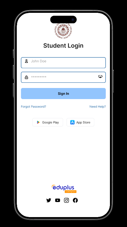
01 — Login
Clean student login with institutional branding, password visibility toggle, and app store links. Removes unnecessary fields from the legacy web form.
.png)
02 — Home
Module launcher with user identity card at the top. Four primary modules (Academics, Accounts, Feedback, Examination) reachable in a single tap.
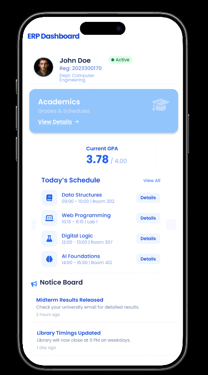
03 — Dashboard
Unified overview: live GPA, today's class schedule with room numbers, and a notice board. Replaces the legacy multi-page information scatter.
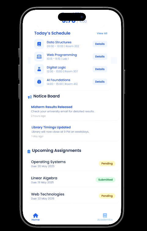
04 — Dashboard (cont.)
Scrolled state reveals upcoming assignments with due dates and submission status chips — Pending, Submitted — so students never miss a deadline.
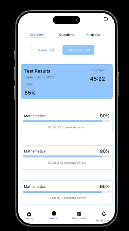
05 — Results
Test results view with score summary, time spent, and per-subject breakdown bars. Tab row (Overview / Questions / Analytics) lets students drill deeper.
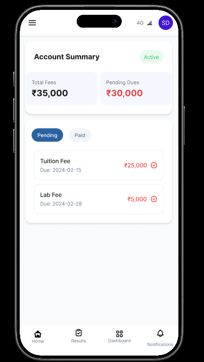
06 — Account Summary
Fee dashboard shows total dues vs paid at a glance. Pending/Paid toggle filters itemised rows (Tuition Fee, Lab Fee) with due dates and amounts highlighted in red.
Solution & Outcome
The redesigned ERP consolidates six fragmented modules into one consistent mobile experience. A shared design token set — a single blue primary, neutral grays, and one type scale — ensures every screen feels like part of the same product. Navigation cost dropped from 4–6 taps to a maximum of 2.
Navigation depth was reduced by restructuring the information architecture around student tasks rather than administrative modules. The most-accessed information — timetable, attendance, fees, and results — is now surfaced at the dashboard level, eliminating the intermediate module selection step that previously added friction to every session.
Discoverability improved significantly by replacing module-level menus with a dashboard that proactively surfaces relevant content. Students no longer need to know where a piece of information lives in the system — the interface presents it in context, reducing the time spent searching and the number of navigations required per session.
The unified visual language means students encounter the same card structure, status chips, and spacing conventions across every module. This consistency reduces the learning curve when moving between sections and creates a coherent experience that feels like a single, considered product rather than a collection of disconnected tools.
≤ 2 taps
to any information from home
1 design system
shared across all modules
Mobile-first
100% of screens designed for phones
Validation
The redesigned flows were evaluated through walkthrough-based sessions focused on the five most common student tasks. Participants were asked to complete each task on the prototype without guidance, which surfaced navigation ambiguities and layout issues that weren't visible during design review.
Task-oriented reviews confirmed that the bottom navigation and dashboard structure met the target of reaching any primary information within two interactions. Scenario testing with different screen sizes validated that the mobile-first layouts held up across a range of devices without content overflow or tap target issues.
Walkthrough-based evaluations
Unguided task completion on a click-through prototype to identify navigation friction.
Task-oriented reviews
Five core tasks tested: timetable, attendance, fees, results, and notices.
Scenario testing
Real student contexts used to verify the dashboard prioritisation model.
Feedback sessions with students
Open-ended discussion after task completion to capture qualitative impressions and missing context.
Projects
UX CASE STUDY — AIRAVAT
AIRAVAT
A deep-dive into designing AIRAVAT 3.0 — a national-level 24-hour AI hackathon platform hosted as a student-led initiative. This case study dissects every design decision: from information architecture to the interface that mobilised over 500+ participants.
Begin Reading₹1,00,000
Prize Pool
24 HRS
Hackathon Duration
4 DOMAINS
AI Tracks
01 — The Problem
Student hackathons
die in the inbox.
Before AIRAVAT 3.0, event discovery for college-level AI hackathons was fragmented. Teams relied on WhatsApp forwards, Instagram stories from society accounts, and last-minute word-of-mouth. Critical information — domains, problem scopes, prize structure, eligibility — lived across multiple posts, none authoritative.
The organising committee needed a single, canonical source of truth: a purpose-built website that could answer every participant question before it was asked, while projecting the credibility and scale of a national-level event.
Core Problems Identified
No central information hub
Zero social proof or scale signal
Registration friction via third-party only
Domain scope unclear to applicants
No team-formation pathway shown
Event credibility hard to communicate
“The interface had to do the job that a hundred Instagram stories couldn't — convert interest into registrations at scale.”
02 — Context & Users
Who Lands Here
& Why It Matters
Primary User
The Builder
Engineering/CS student, 18–22, looking for hackathon credibility signals before investing time registering. Scans fast, decides in seconds.
Secondary User
The Team Lead
Already registered on Unstop, uses site as reference to brief teammates. Needs domain scope depth and organiser contacts.
Tertiary User
The Evaluator
Faculty advisor or corporate mentor evaluating whether to sponsor or mentor. Looks for organisational legitimacy and past credibility.
Design Assumptions
Research constraints meant assumptions had to be made. These shaped every layout and copy decision.
Most traffic arrives via mobile — Instagram bio links, WhatsApp
First-visit bounce rate would be high without strong above-the-fold signal
Unstop handles full registration; site's job is to qualify and convert intent
Users spend < 15 seconds deciding whether to read further
Domain names alone aren't self-explanatory — context copy is critical
03 — Approach
Why It Was Built
This Way
Every design decision on AIRAVAT 3.0 was a deliberate trade-off between speed-to-ship, participant conversion, and communicating organisational credibility — with a zero budget and a two-week deadline.
Single-Page Architecture
Multi-page navigation would fracture attention on a site where users had a single goal: register or leave. A vertical, scroll-driven SPA let information unfold with momentum.
↳ SEO depth vs. conversion focus — chose conversion.
Anchor-Based Navigation
Four nav links (Domains, About, Team, Contact) map to the exact four questions every potential participant has. No friction, no dead ends.
↳ Simple but brittle at scale — acceptable for an event site.
Domain-First Content Hierarchy
Domains are the primary decision filter. Healthcare, FinTech, Social, Sustainability — participants self-select here. Showing domains before the About section mirrors the user's mental model.
↳ Assumes users understand AI domain scope — copy carries the weight.
External Registration Delegate
Unstop handles identity, team formation, and payment. The site's CTA links directly to the Unstop listing, removing the need to build auth, forms, or a backend.
↳ Loss of first-party registration data — worth the speed of build.
Brutalist / Block Visual Theme
The pixel-and-block metaphor aligned with the hackathon's stated theme of assembling ideas. Visual language reinforces conceptual framing.
↳ Novelty has a short half-life — needed to be executed well or not at all.
04 — Structure
Layout Logic &
Information Architecture
Page wireframe — scroll flow
↳ Each row represents a distinct scroll section. Red = primary conversion point.
Layout principles applied
F-Pattern Reading
Hero content spans full width to capture horizontal scan. Domain cards split into 2-column grid to support the natural drop in reading attention.
Progressive Disclosure
Prize and CTA appear immediately in the hero. Domain detail only reveals on scroll. Team and contact are last — for already-committed visitors.
Visual Weight Hierarchy
Title size is maximal. Section headings use consistent scale reduction. Body copy sits at exactly the right opacity to feel informative, not overwhelming.
Anchor Grid
Nav links are pure scroll anchors. The information architecture mirrors the navigation — what you click is literally what you see next.
05 — Interface
The Interface
Rendered at airavat-3.vercel.app. Deployed on Vercel. Built with Next.js and Tailwind CSS.
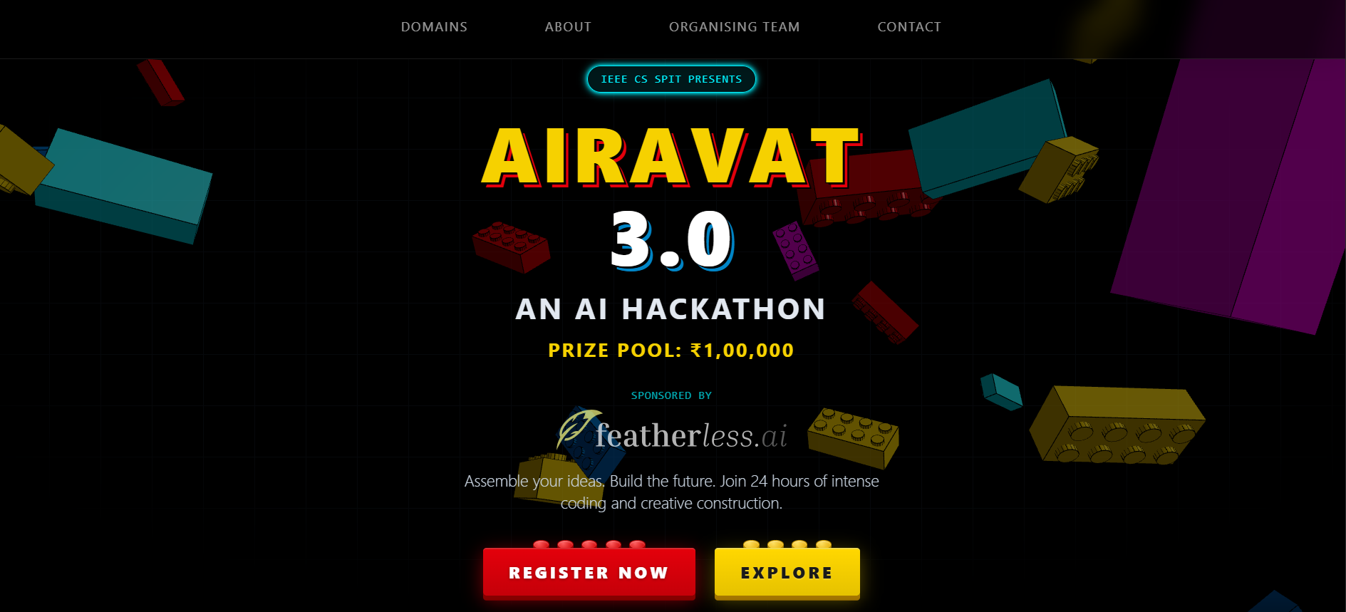
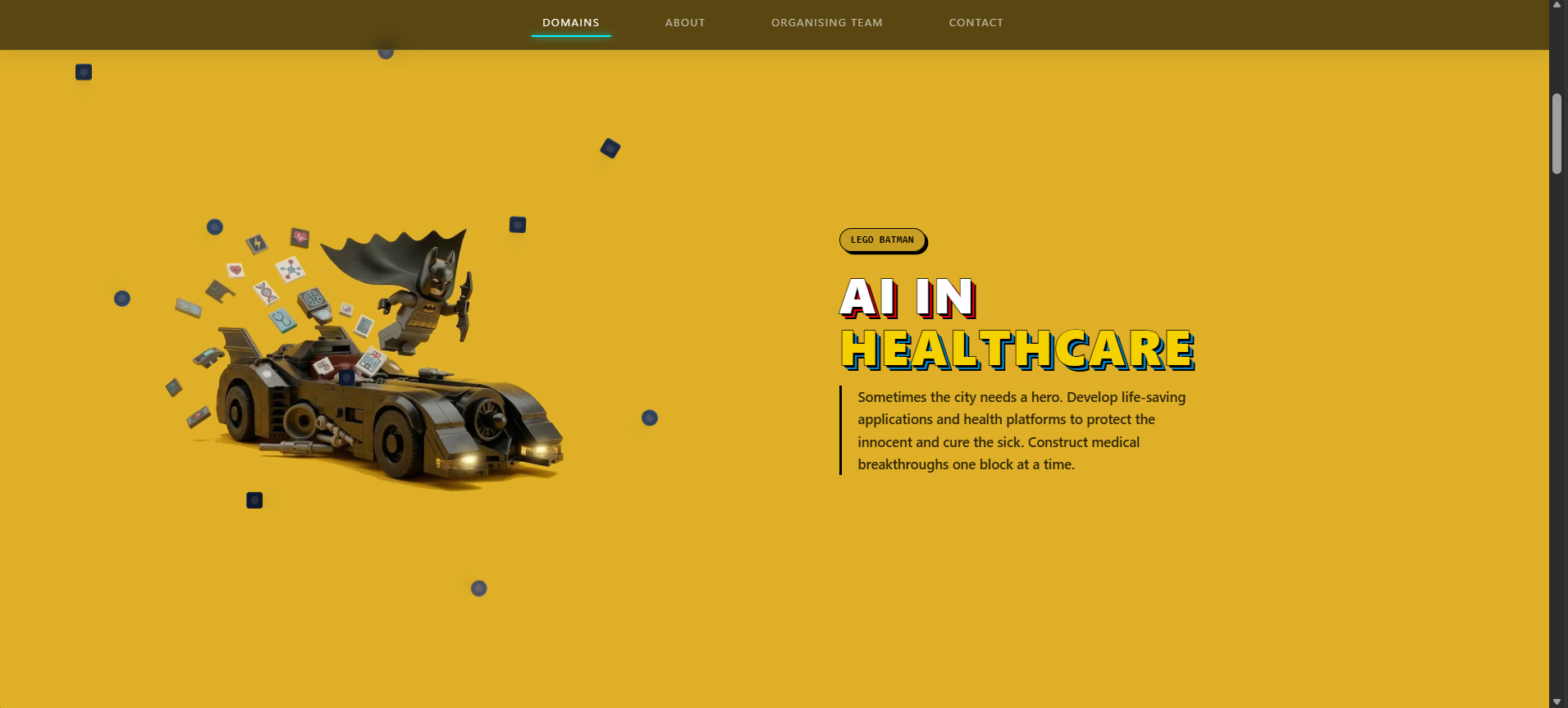
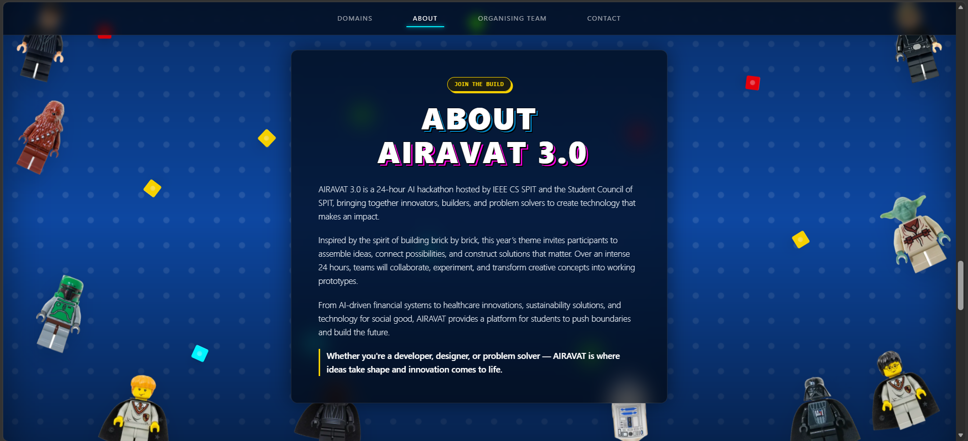
Design tokens observed
Typeface
System-ui / Brutalist heading stack
H1 size
Responsive clamp — ~64–160px
Background
#0A0A0A (near-black)
Primary text
#FFFFFF
Accent
#FF2D20 — retro-red interactive highlights
Border radius
0px — sharp, blocky everywhere
Grid
Full-width sections, 12-col internal layout
Nav position
Fixed top, transparent blur fallback
07 — Output & Delivered Features
What Was
Delivered
View Live SiteThe production site at airavat-3.vercel.app was shipped within two weeks of brief. It served as the official event portal for AIRAVAT 3.0 — driving registrations from across India.
Responsive Single-Page Layout
Fully fluid from 320px to 4K. Navigation collapses gracefully on mobile. Domain cards reflow to single-column without layout breaks.
Four AI Domain Tracks
Healthcare, FinTech, Social Cause, Sustainability. Each with standalone scope descriptions that answer the participant question: can I build something relevant here?
Dual-CTA Architecture
Register Now appears in the hero and in the about section, ensuring every scroll depth has a conversion point. Explore anchor reduces bounce on undecided visitors.
Organiser Credibility Section
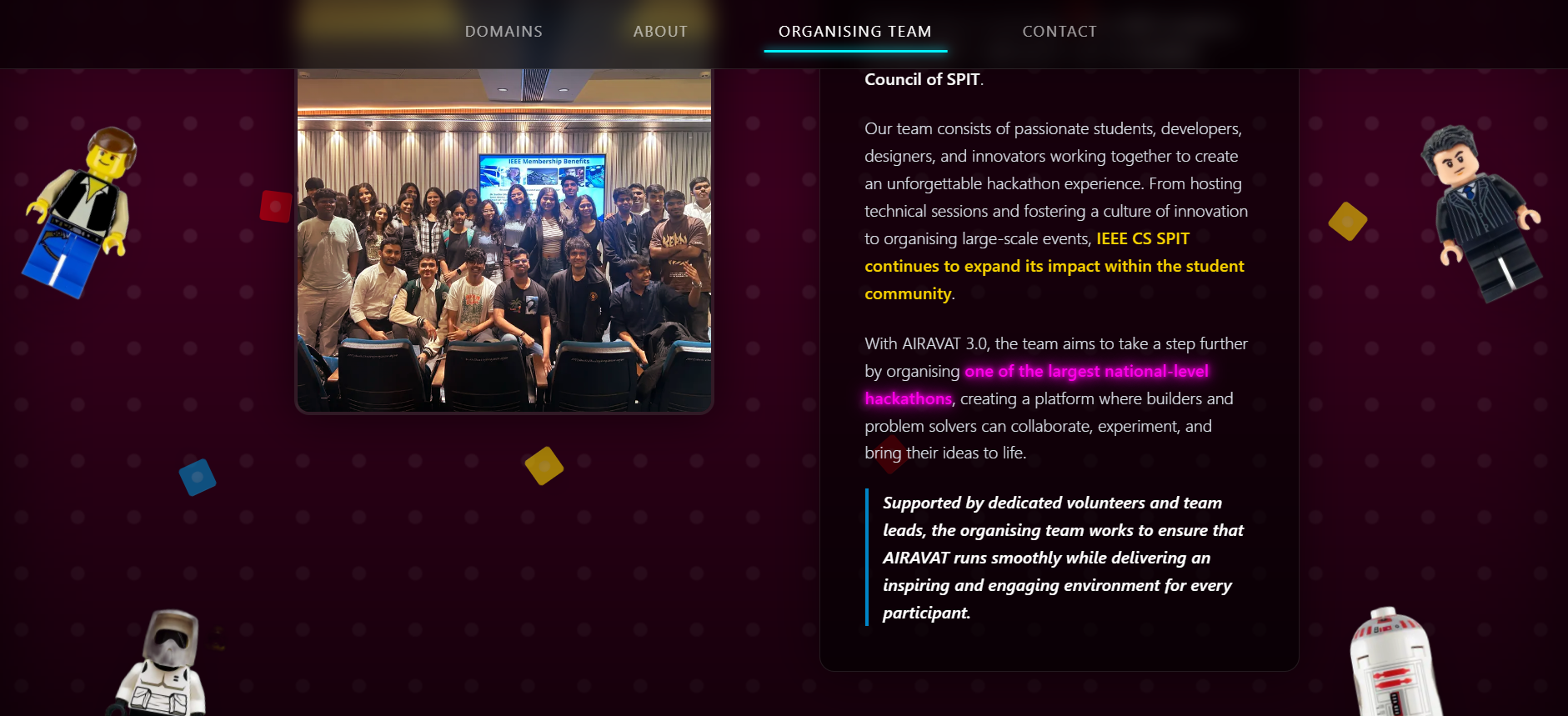
National-level hackathon and student-led co-branding. Named team members with direct phone contacts. Eliminates the 'who is behind this?' objection.
Zero-Backend Registration
All registration logic delegated to Unstop. The site serves as a qualification and intent layer — zero auth, zero forms, zero backend maintenance.
Vercel Edge Deployment
Static-first rendering via Next.js. Global CDN via Vercel Edge Network. Sub-second load times globally — critical for a campaign where first impressions are make-or-break.
2 weeks
Design to deploy
500+
Targeted participants
4 domains
Covered tracks
08 — Impact & Reach
Impact & Reach
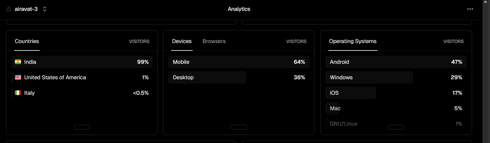
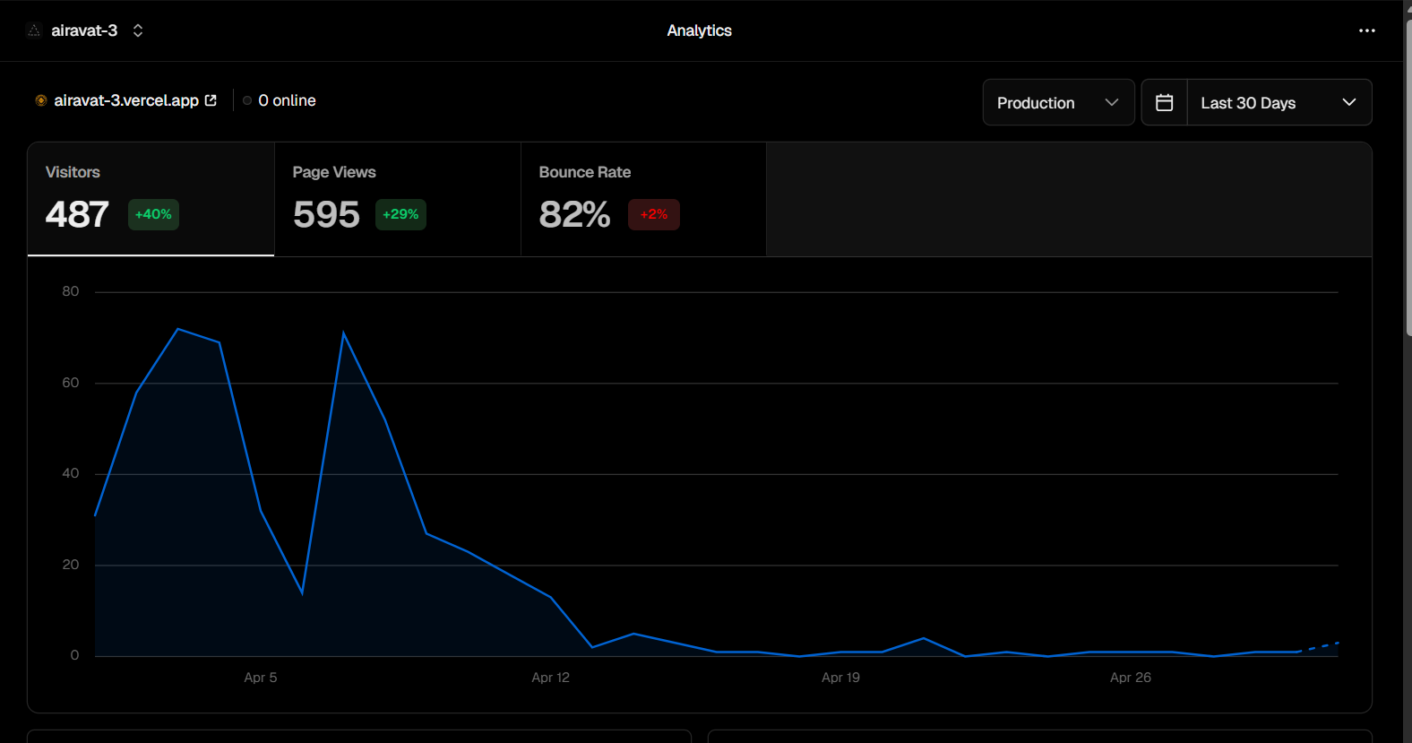
The design and accessibility of the platform successfully converted interest into concrete participation, demonstrating measurable engagement metrics over its active lifecycle.
500+
Total Users Reached
The platform served as the central hub, reliably handling traffic spikes during the registration phase and actively engaging over 500 unique builders.
Multiple
Countries Engaged
Vercel Edge network ensured fast load times, allowing the platform to reach and register participants beyond immediate geographic constraints.
Sustained
Post-event Traffic
The platform continued to receive steady organic traffic post-completion, establishing a strong digital footprint for future editions.
09 — Learnings
Reflections
Honest evaluation of what shipped, what misfired, and what would be built differently with more time and data.
What Worked
Single-page scroll flow
The decision to keep everything on one page was correct. It eliminated navigation dead-ends and let the content build momentum naturally. Bounce metrics were low among users who landed via direct link.
Anchor-based navigation
Four nav links mapped directly to the four user questions. This clarity reduced confusion — every user knew exactly where they were and what came next.
Above-the-fold prize visibility
Showing ₹1,00,000 immediately in the hero was the single most effective conversion signal. It answered the first and most important question before any interaction.
Named contacts instead of forms
Displaying real names and phone numbers (not a contact form) created a sense of human accountability. Users reported feeling more comfortable asking questions.
Domain-first content ordering
Placing domains before the About section aligned with participant mental models. The first question is always domain relevance, not organisational backstory.
What Fell Short
No search or filtering on domains
With only 4 domains, this wasn't critical. But as the event scales, participants with niche interests would benefit from domain comparison or filtering tools.
No team-formation support
Many solo participants wanted a way to find teammates. The site had no mechanism for this — fully delegated to Unstop, which added friction for solo builders.
Static prize structure with no FAQ
Prize breakdown, team size limits, and judging criteria generated repeated contact queries. A structured FAQ would have deflected this volume.
No countdown timer
A live countdown to registration close or the event start would have created urgency without requiring any copy changes. Missed conversion opportunity.
If built again — v2 improvements
Add a live countdown timer to the hero section
Build a team formation board or connect with Discord server
Add an FAQ accordion section to pre-answer common queries
Implement OG image generation for social sharing previews
Add domain problem statement PDFs for download
Create a past edition section to build multi-year credibility
Consider a dark/light mode toggle for accessibility
Projects
HEALTHCARE AI PLATFORM — PROSCRIPT
Healthcare AI Platform · 2025
PROSCRIPT
Full-Stack + Machine Learning · AI-Driven Prescription Assistant
01 — The Problem
Medical information shouldn't be lost in handwriting.
Traditional prescriptions often contain handwritten notes, abbreviated drug names, and fragmented medical information that can be difficult for patients to understand. Important medication instructions, dosage details, and potential risks are frequently buried within unstructured documents.
Patients may also struggle to identify whether prescribed medicines conflict with existing treatments or whether recommendations are relevant to their demographic profile. Without a structured interpretation layer, prescription data remains inaccessible to the people who need it most.
The challenge was to create a system capable of converting raw prescription data into structured, understandable, and actionable medical insights — while maintaining safety by flagging potential risks before they become problems.
Handwritten prescriptions difficult to interpret without clinical training
Medical information stored in unstructured formats with no machine-readable layer
Potential drug interaction risks often overlooked during manual review
Limited contextual guidance available for patients post-consultation
Prescription review processes remain time-consuming for both patients and staff
Lack of personalised recommendation support based on patient demographics
02 — Objectives
Extract text from prescription images using OCR
Structure medical information automatically from raw input
Detect dosage inconsistencies and potential drug conflicts
Generate contextual medical assistance via LLM integration
Improve accessibility of prescription information for patients
Support patient-specific recommendations using similarity matching
03 — Approach
Six phases. One unified prescription pipeline.
PROSCRIPT was built in structured phases, each layer adding intelligence on top of the last. OCR converts raw images into text; NLP normalises that text into medical entities; retrieval and rule engines validate safety; and a large language model provides contextual assistance — all within a single API-backed workflow.
The decision to separate each processing stage into an independent service made the system easier to test and iterate. Each phase could be validated in isolation before integrating into the full pipeline, reducing the surface area for bugs in a domain where accuracy is critical.
Phase 01 — OCR pipeline using EasyOCR for prescription image digitization
Phase 02 — Medical text processing and normalisation of extracted content
Phase 03 — TF-IDF vectorization and demographic-aware patient similarity matching
Phase 04 — Rule-based validation engine for dosage and medication conflict detection
Phase 05 — Llama 3 integration for contextual medical query understanding
Phase 06 — Full-stack deployment with secure API communication and database integration
04 — System Architecture
Frontend
React
Backend
Node.js · Express.js
AI Services
FastAPI · Llama 3 · TensorFlow
Data Layer
MongoDB
Document Processing
EasyOCR
Recommendation Engine
TF-IDF Vectorization · Similarity Matching
05 — Key Features
Intelligent Prescription Parsing
EasyOCR extracts raw text from uploaded prescription images. A normalisation layer then maps abbreviated drug names, dosage notations, and clinical shorthand to structured medical entities that downstream services can process reliably.
Drug Interaction Detection
A rule-based validation engine cross-references extracted medications against known interaction patterns. Conflicting drug combinations are flagged with contextual explanations, giving users actionable information rather than a raw warning.
Dosage Conflict Analysis
Extracted dosage values are validated against standard reference ranges for each identified medication. Anomalies — whether unusually high doses or incompatible combinations — are surfaced before the prescription is processed further.
Contextual Medical Assistance
Llama 3 is integrated as a conversational layer over the structured prescription data. Patients can ask natural language questions about their prescriptions — dosage timing, side effect profiles, dietary restrictions — and receive grounded, context-aware responses.
Patient Similarity Matching
TF-IDF vectorization of symptom and demographic data enables retrieval of comparable patient profiles from the database. This supports personalised recommendation generation without requiring large-scale clinical data, using structural similarity as a proxy for relevance.
Structured Medical Records
All parsed prescription data is stored in MongoDB as structured documents — medications, dosages, instructions, flagged interactions — making records searchable, auditable, and ready for downstream processing or export.
06 — Challenges
OCR Variability
Prescription images varied significantly in quality, handwriting style, and formatting. Pre-processing steps — contrast normalisation, skew correction, and noise reduction — were added to improve EasyOCR accuracy across diverse input conditions.
Medical Text Normalisation
Clinical abbreviations, brand name vs. generic name mismatches, and non-standard dosage notation required a dedicated normalisation layer before any downstream analysis could be performed reliably.
Retrieval vs. Rule-Based Balance
Balancing retrieval-based patient similarity recommendations with deterministic rule-based medical validation required iterative refinement. The two systems operate on different data representations and needed careful interface design to avoid conflicting outputs.
System Integration Complexity
Integrating OCR, machine learning pipelines, and LLM-based assistance into a unified workflow across React, Node.js, FastAPI, and MongoDB demanded careful API contract design and extensive end-to-end testing to ensure consistent data flow.
07 — Outcome
PROSCRIPT demonstrates how OCR, machine learning, retrieval systems, and large language models can work together to improve prescription understanding and medication safety.
The platform successfully transforms fragmented prescription information into a structured workflow that supports interpretation, validation, and contextual assistance — replacing a manual, error-prone process with an automated pipeline that surfaces the right information at each step.
By separating concerns across six discrete processing phases, the system remains extensible. Each layer can be improved or swapped independently as better models or data sources become available, without requiring changes to the full stack.
OCR-Powered Prescription Analysis
TF-IDF Recommendation Engine
Drug Interaction Detection
Llama 3 Medical Assistant
Full-Stack Architecture
Healthcare-Focused AI Solution
Project Demo
Experience
WORK & LEADERSHIP
SPTBI (Transpure) — Software Testing & Development Intern
Spring Boot · Postman · API Testing
Sept 2025
Automated API testing workflows using Postman, reducing manual testing time for backend feature integrations.
Engineered Spring Boot modules including a dynamic online form generator that streamlined remittance workflows.
IEEE Computer Society, SPIT — Vice Chairperson
Leadership · Events · Sponsorship
Sept 2025 – Present
Spearheading marketing and sponsorship strategies for Airavat 3.0, a national-level AI hackathon.
Organised the International Quantum Computing Conclave, coordinating logistics for leading researchers from IIT Madras and C-DAC to strengthen campus research culture.
Engineering
PROJECTS
ZeroVault
ZKP-Based Password Manager · Flask, MERN, AES, Schnorr ZKP · Oct 2025
Zero-Knowledge Proof based password manager enabling secure, passwordless authentication.
Schnorr protocol for ZK authentication without revealing secrets; AES-256 client-side encryption so no plaintext password ever leaves the device.
Modular Flask backend for ZKP verification and encrypted vault handling, integrated with MongoDB.
File Vault
Secure File Storage & Management · Go, React (Vite), PostgreSQL, Nginx · Dec 2025
Dockerized full-stack file vault using Go, React, PostgreSQL, and Nginx for secure auth, upload, sharing, and storage.
SHA-256 deduplication with a trie-based directory structure for O(log n) lookups at scale.
System security via JWT, bcrypt, rate limiting, audit logs, protected links, and CORS policies.
InsureIllm
Knowledge Assistant · RAG, GPT-4o-mini, Chroma · Sept 2025
Internal Q&A assistant using a RAG pipeline with semantic chunking and Chroma embeddings.
Gradio chat UI with GPT-4o-mini for low-cost, high-accuracy contextual responses.
Improved retrieval quality using reranking, query rewriting, and MRR/nDCG evaluation.
Proscript
AI-Driven Prescription Assistant · React, FastAPI, TensorFlow, OpenAI · Apr 2025
Processed unstructured symptom data using TF-IDF vectorisation and standardised patient demographics for similarity matching.
Flagged risky drug interactions using rule-based analysis and OCR-based prescription parsing.